1 July 2026
Art Nouveau and Wine — the Story Behind Our Labels
When we designed our labels, we looked at Art Nouveau not as a historical reference but as the only honest language for wine

Every wine label is an argument. It argues for a price, a tradition, a personality, a category of buyer. The minimalist label argues for seriousness. The family-portrait label argues for heritage. The coat-of-arms argues for authority. Labels that look like they were designed in the 1970s and have not been updated since are arguing, quietly, for the proposition that nothing needs to change.
When we sat down to design the visual identity of Maison Bugnazet, the first question was not "what should our labels look like?" It was "what do we actually believe about the relationship between wine and beauty?" Art Nouveau arrived as the answer before we had finished asking the question.
Why Art Nouveau and Not Something Else
Art Nouveau emerged in the 1890s as a reaction against the industrialisation of decorative arts. Its practitioners — Alphonse Mucha most visibly, but also Hector Guimard, Victor Horta, Jan Toorop — drew their formal vocabulary from the natural world. Vines, flowers, flowing water, the curve of a woman's hair, the tendrils of climbing plants: these were not ornaments placed on top of a design. They were the design itself, the organising principle, the argument that beauty grows rather than being constructed.
The connection to wine is not metaphorical. It is almost literal. The vine — Vitis vinifera — is the most Art Nouveau of all plants: its tendrils curl exactly as an Art Nouveau border would curl, its leaves spread in the same kind of asymmetric abundance that the movement's designers celebrated. When Mucha was commissioned to design advertising posters for champagne houses in the 1890s, the visual language came naturally because the subject demanded it.
What Art Nouveau rejected was the straight line, the mechanical repetition, the democratic neutrality of industrial production. Wine, made honestly, rejects the same things. Each vintage is asymmetric. Each terroir imposes its own form. The vine does not grow in straight lines.
Vegetal Curves and What They Mean
The specific formal elements of Art Nouveau — the flowing line, the vegetal curve, the frame that becomes part of the image rather than containing it — translate into wine labels through several practical decisions.
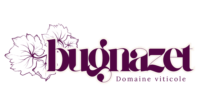
Our labels use ornamental border work drawn from botanical illustration rather than geometric pattern. The line weights vary, thickening and thinning as a vine stem would, rather than maintaining the consistent mechanical stroke of a typeset rule. The colour palette tends toward the organic: deep burgundy, sage, ivory, terracotta, gold — colours that read as natural pigments rather than printing primaries.
The typography is integral to this approach. Art Nouveau typography — the lettering that appears on Mucha's posters, on the Paris Métro entrances, on the facades of Brussels' Art Nouveau houses — is never neutral. The letters have personality, curvature, a relationship to each other that goes beyond spacing. They feel hand-drawn even when they are not, because the system of curves that governs them comes from the same place as the botanical ornament surrounding them.
This is why our cuvée names remain in French on every label, even for markets where the language is not native. The names — Rendez-Vous, Premier Rendez-Vous, Vent de Tendresse, Bouquet Fleurie, Morgon de Toi — were composed as part of a visual and typographic whole. Translating them would break that whole. They are not captions; they are elements of the design.
Mucha and the Wine That Already Knew Him
Alphonse Mucha remains the most referenced Art Nouveau artist in popular consciousness, and there is a reason the label process returned to him repeatedly. Mucha's women — his advertising figures for Job cigarette papers, for Moët & Chandon, for the Salon des Cent — are never merely decorative. They are present in the work in the same way that a terroir is present in a wine: they give character to everything around them without being reducible to a single element.
What struck us looking at Mucha's wine-adjacent work was how the human figure and the botanical ornament were equals, neither subordinate to the other. The woman's hair flows into the vine. The vine's curves echo the figure's posture. The border does not surround the image — it grows out of it.
I keep coming back to that specific quality: not decoration applied to a product, but design that embodies the product's character. A label for Fleurie should feel as aromatic as the wine. A label for Morgon should carry geological weight. The visual language should be consistent enough to read as a house style, but specific enough that each cuvée is visually distinct.
The Creation Process
The design process for a Bugnazet label begins with the wine itself — not with briefs or positioning documents. Before any visual work starts, the winemaker and the editorial director taste the wine together and describe it in words that are not technical. Not "medium tannins, berry fruit," but "the colour of a dark garden in early summer," or "something mineral that feels like cold stone under a warm hand."
These descriptions become the brief. The designer works with that language, finding botanical references, historical ornament, typographic references from Art Nouveau archives. Multiple rounds of drawn sketches precede any digital work. The goal is a label that could, theoretically, have been made in 1900 — not because we are nostalgic for that period, but because Art Nouveau was the last moment in design history when the vocabulary of wine and the vocabulary of art were genuinely unified.
That goal sounds ambitious until you hold the result. Then it just sounds honest.
The label that comes out of this process is one that requires looking at. Not for analysis, but for the same reason you look at a flower in a garden: because it is there, and because it is beautiful, and because beauty is part of what wine is for.
→ Explore our selection
All journal articles